To develop No Thyme's visual identity, we began by distilling our product vision into elements that could help guide our explorations.
Fresh & Delicious
For a cooking app, what could be more important?!
Adventurous
Food is a rich tapestry of different colors, textures, smells and tastes. We aimed to build a place where people come to explore the world on their fork.
Delightful
Cooking should be fun! We aimed to build a whimsical, delightful experience that made people smile.
Togetherness
Food brings people together. We aimed to keep people focused on the reward just an “oven ding” away - a delicious meal with those they love.
Name
We set out to find a name that was delightful, easy-to-remember, clearly articulated our brand vision of making it quick, easy and fun to get dinner on the table and had anavailable domain name and handle across major social media platforms. We love puns and while we brainstormed and tested many names, “No Thyme” was a clear fan-favorite with ties to both cooking and our value position of making it quick, easy and fun to cook when you have “no time”.
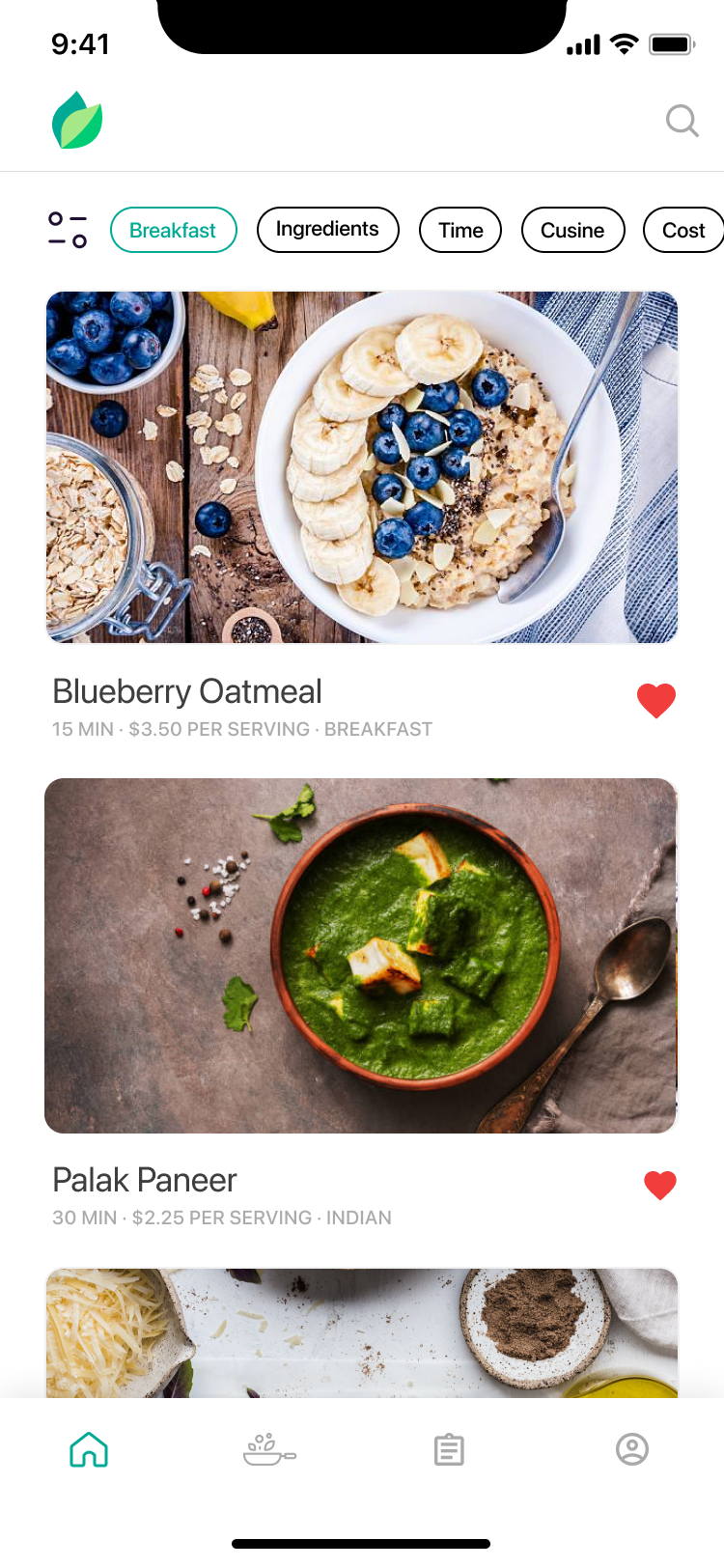
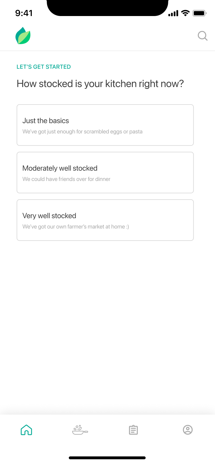
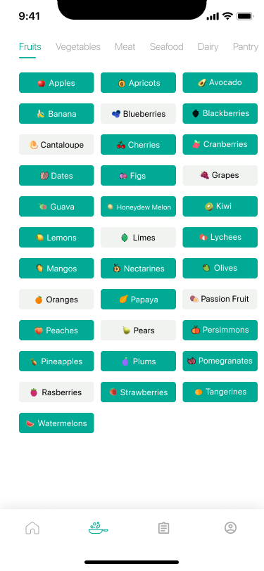
Color Palette
We wanted a color scheme that was representative of the food world and focused our attention on green to evoke a feeling of freshness. In the app, imagery is the star of the show and thus we chose a monochromatic color scheme that let the food photography shine.

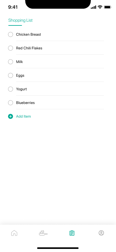
Typography
We wanted the app to feel clean and familiar and thus chose to use system fonts throughout the app. SF Pro is a neutral, flexible, sans-serif typeface for iOS, while Roboto features both geometric forms and open curves on Android.
Voice and Tone
Our brand voice and tone is our personality and we aimed to be:
Witty
Starting with our name, we aimed to introduce moments of delight through messaging that puts a smile on your face.
Helpful
We’re hospitable and here to help with whatever you need to get dinner on the table quickly and easily.
Human
We're human! There are real people curating recipes in the app and behind every e-mail, social media post and more.
Clear
We aimed to be crisp and concise, communicating with parsability and scanning in mind.
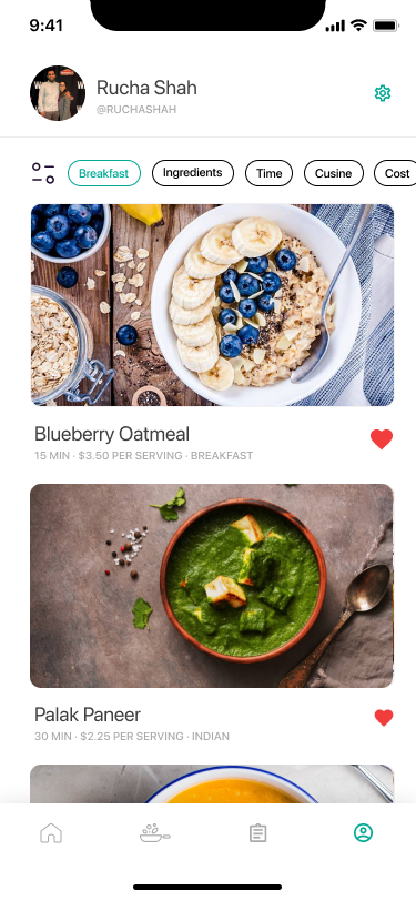
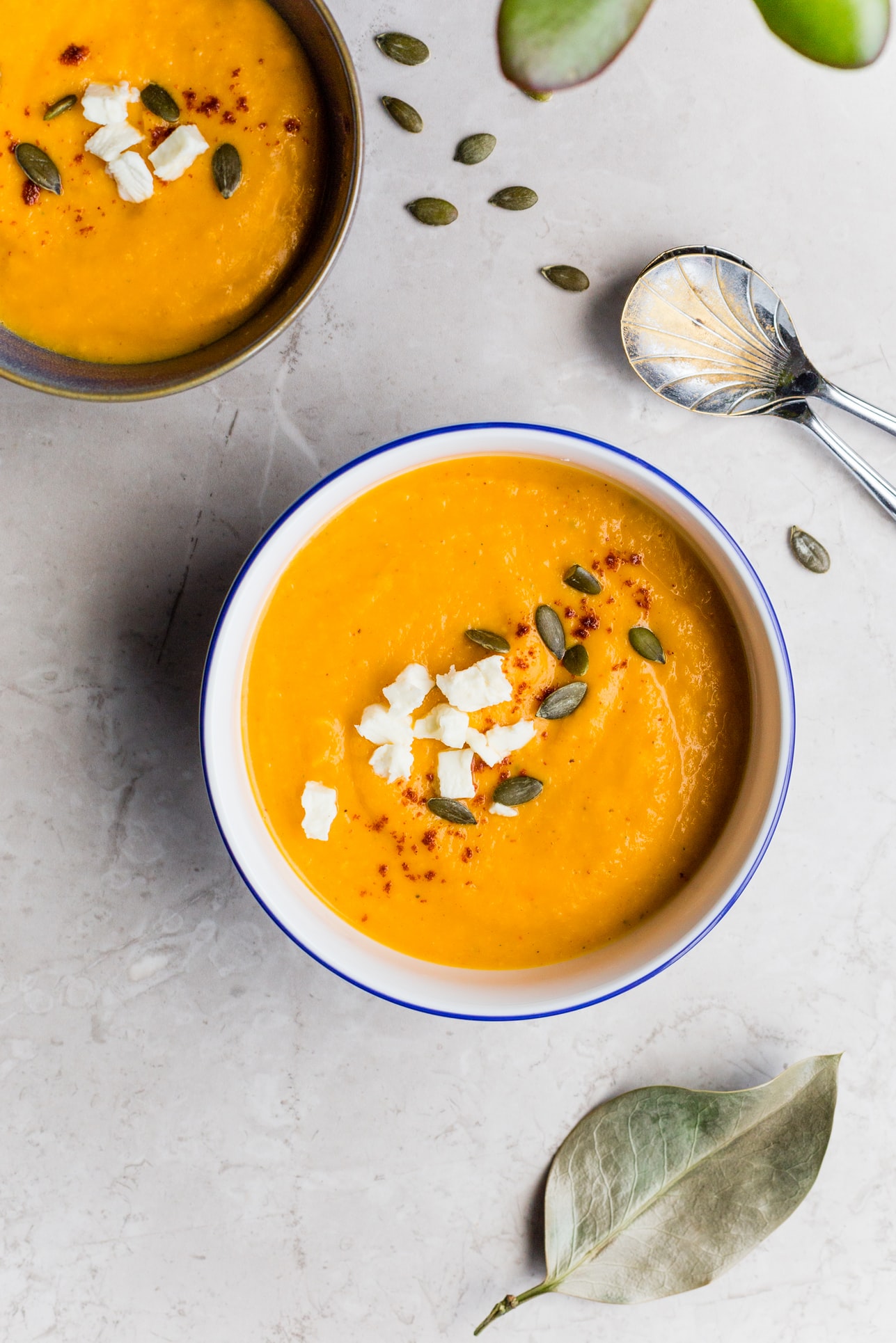
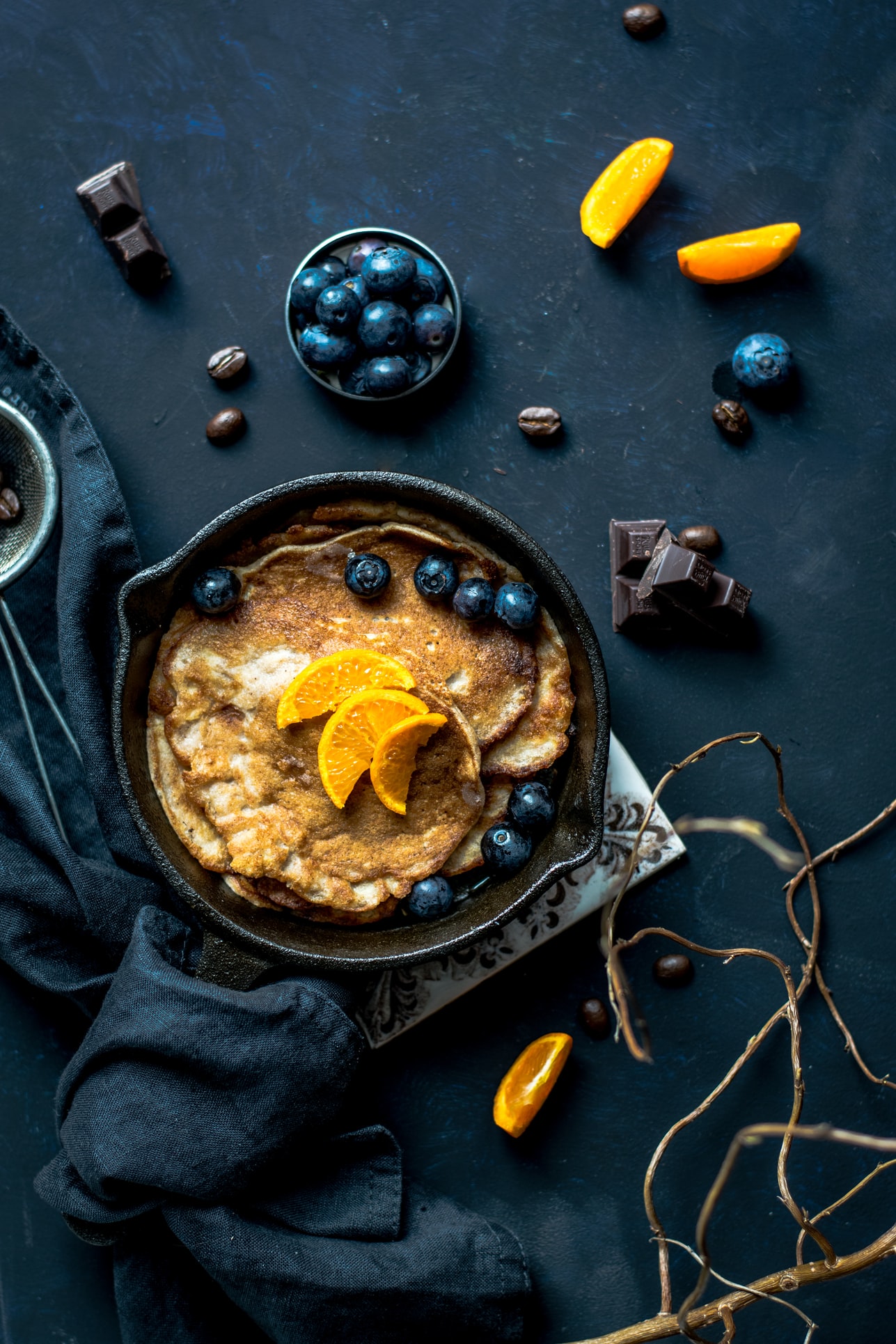
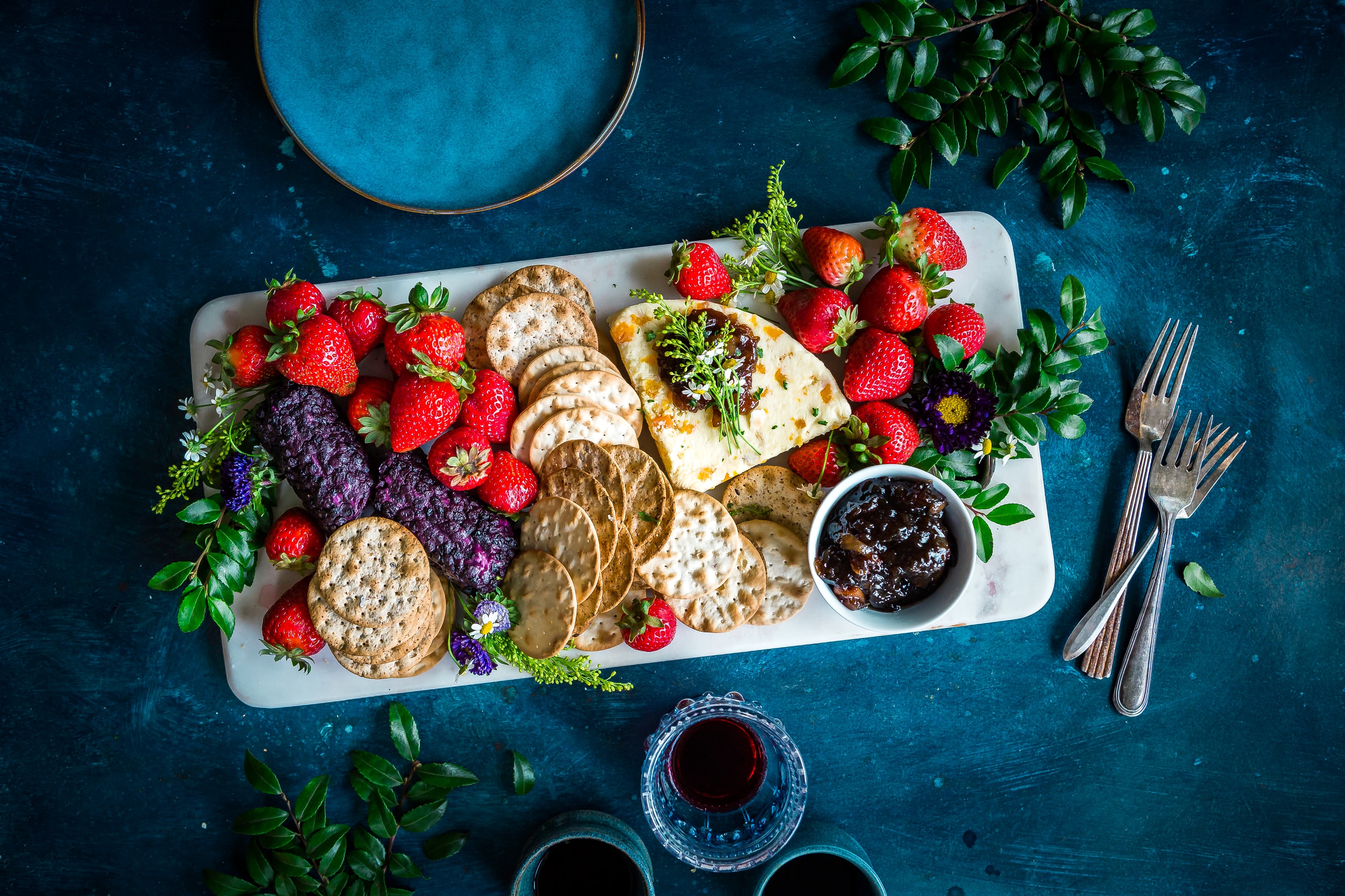
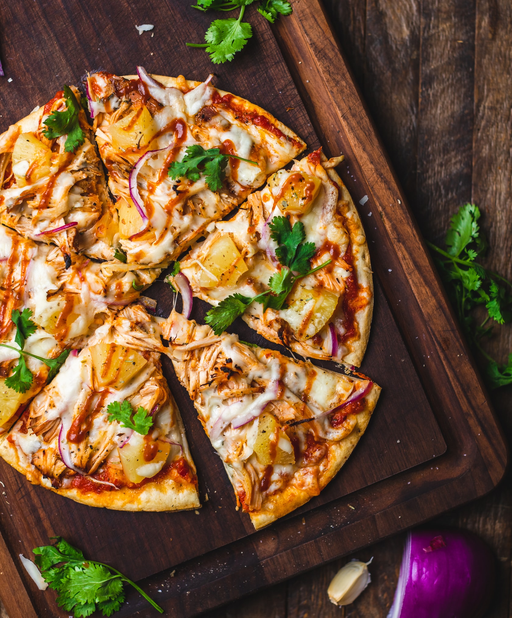
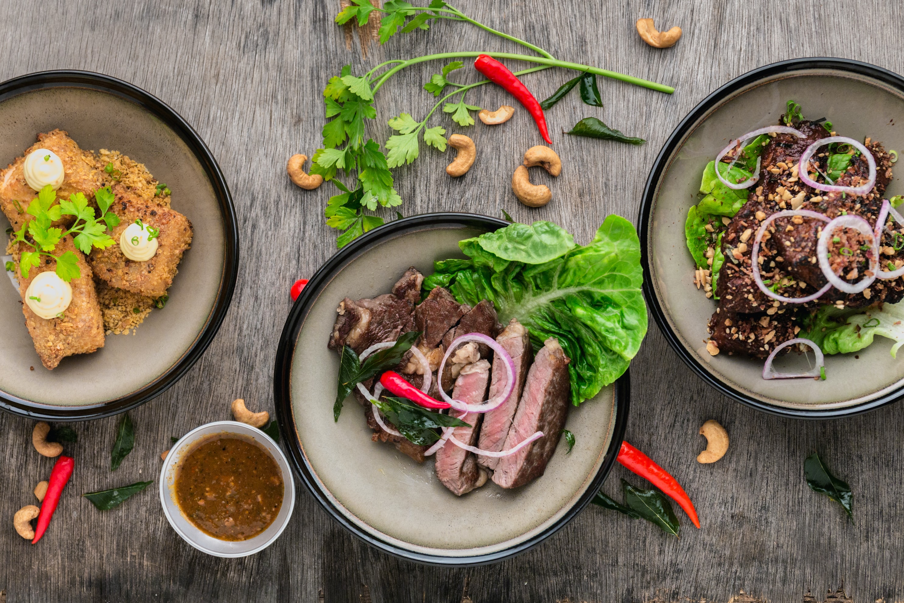
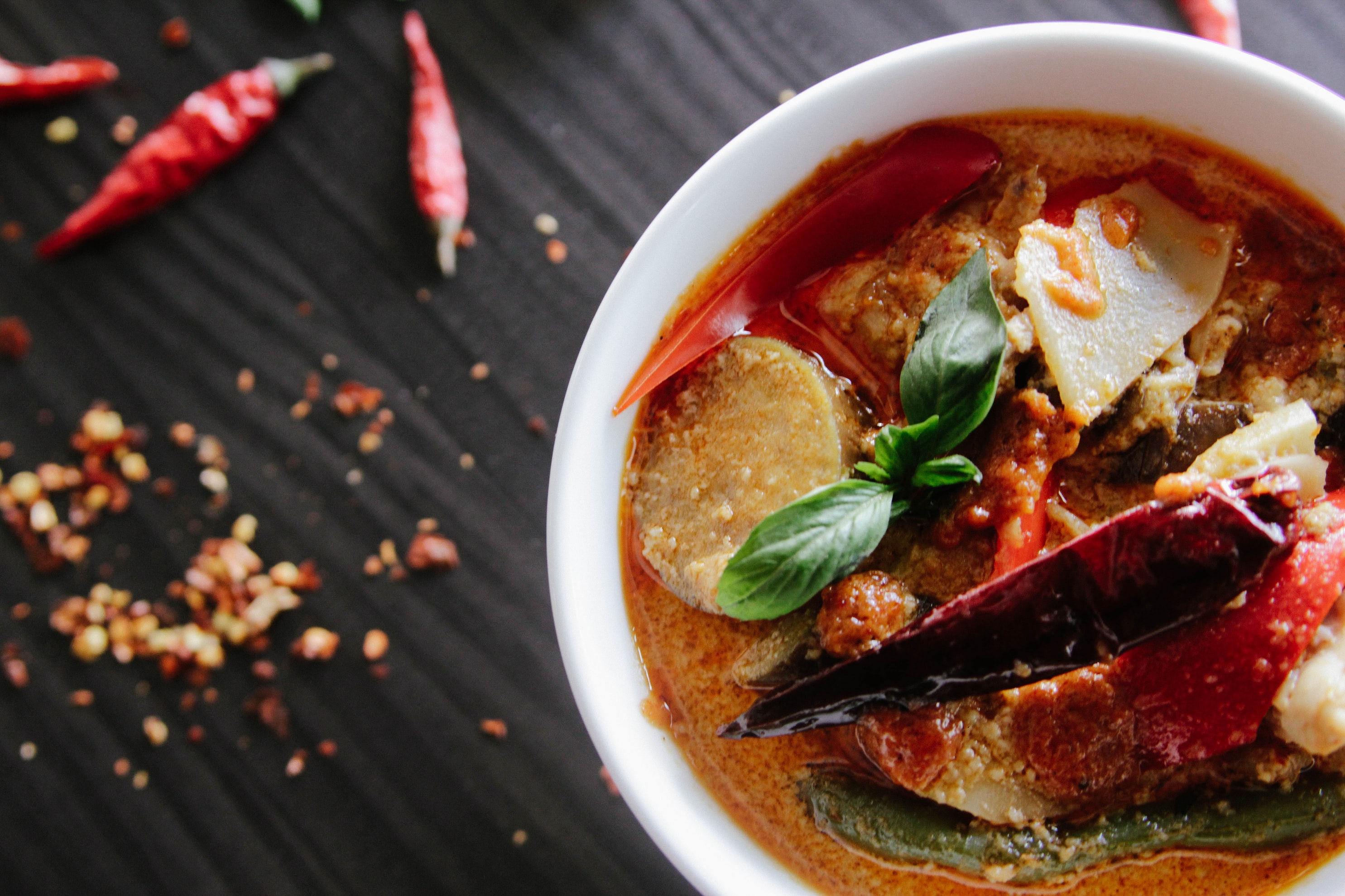
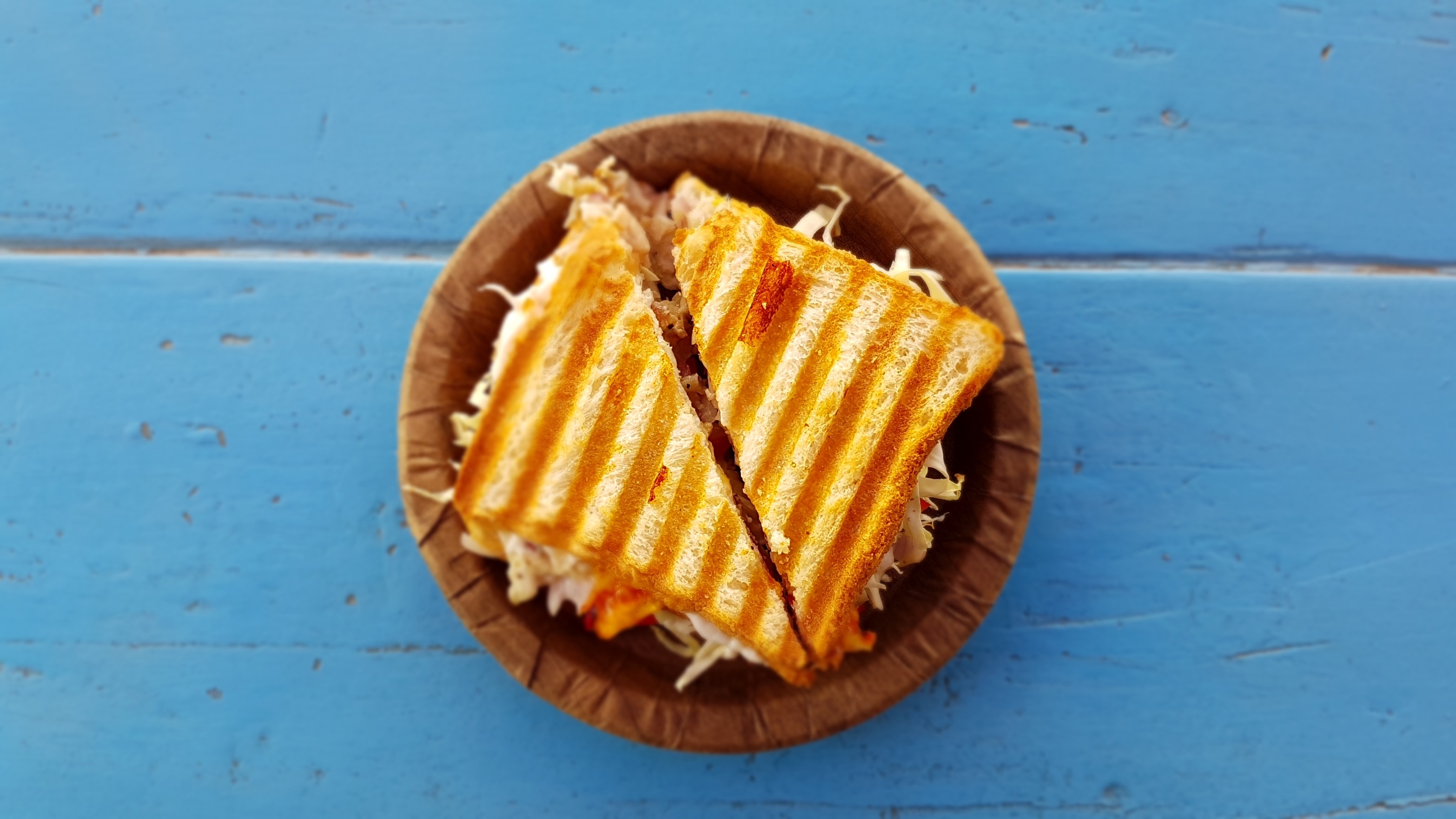
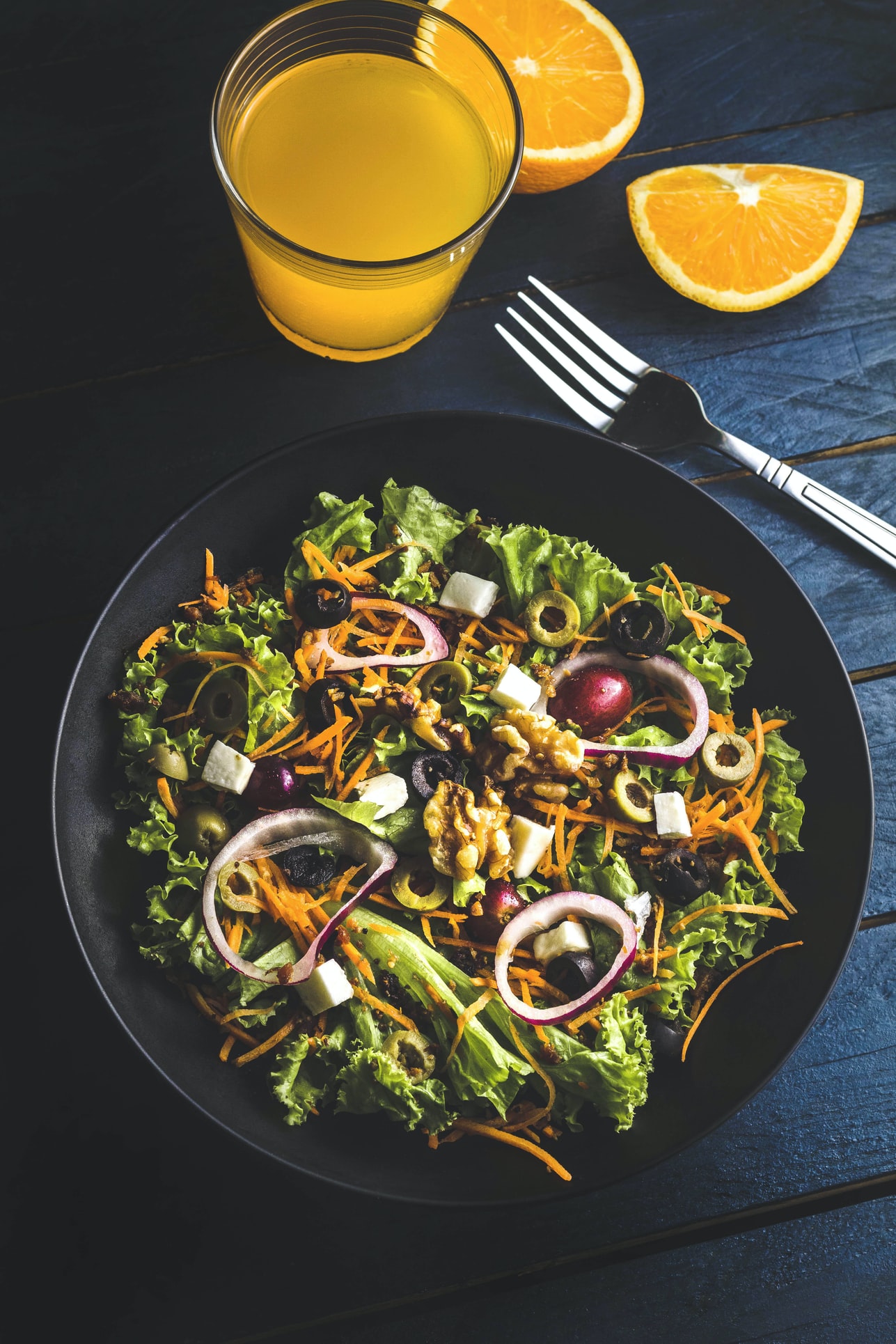
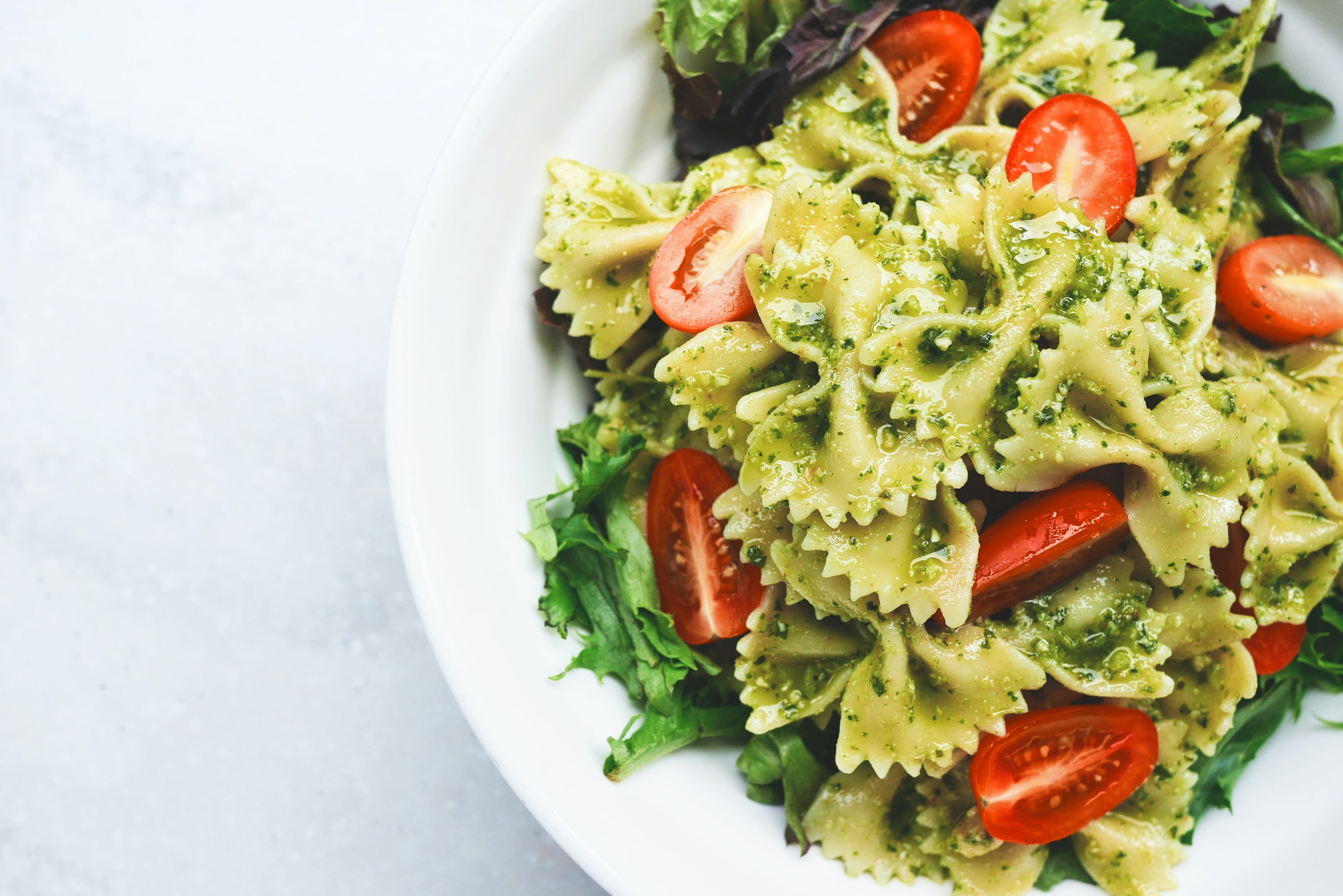
Photography
"Your eyes can be bigger than your stomach". When it comes to food, photography is the star of the show. We looked for premium stock photography shot in a modern aesthetic with natural light, rich vibrant colors, neutral backgrounds and well-decorated scenes where the dish shines. Even though we relied on stock imagery, we attempted to use flat-lay photos whenever possible to have a consistent look-and-feel throughout the app.