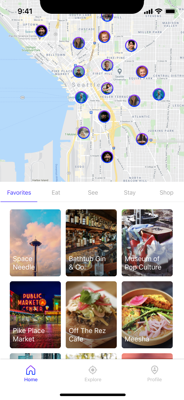
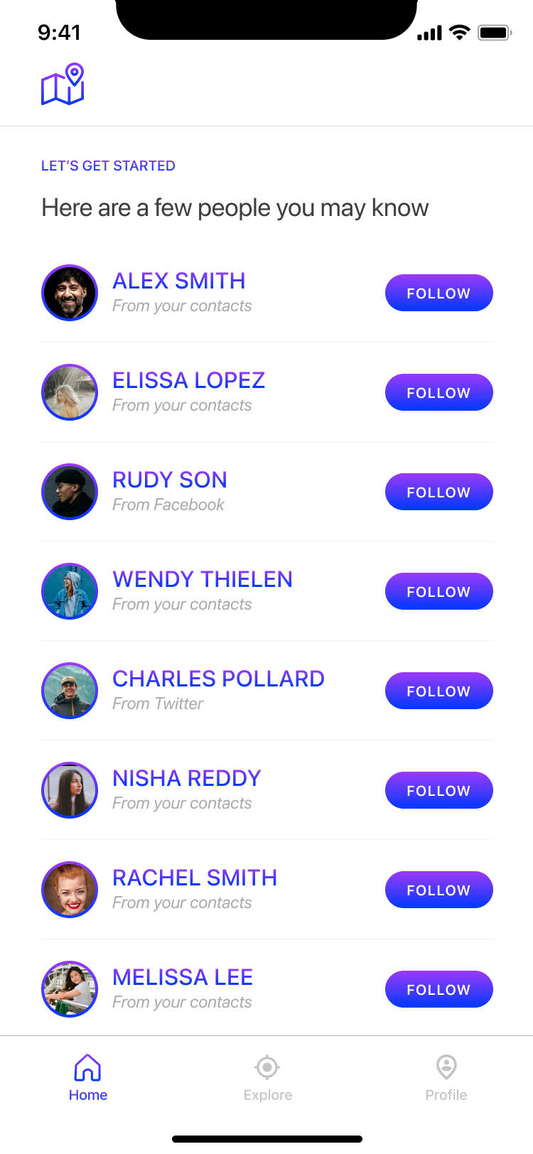
Onboard quickly
Easily follow family and friends on Wander Guide to find trusted tips and recommendations for your next trip.

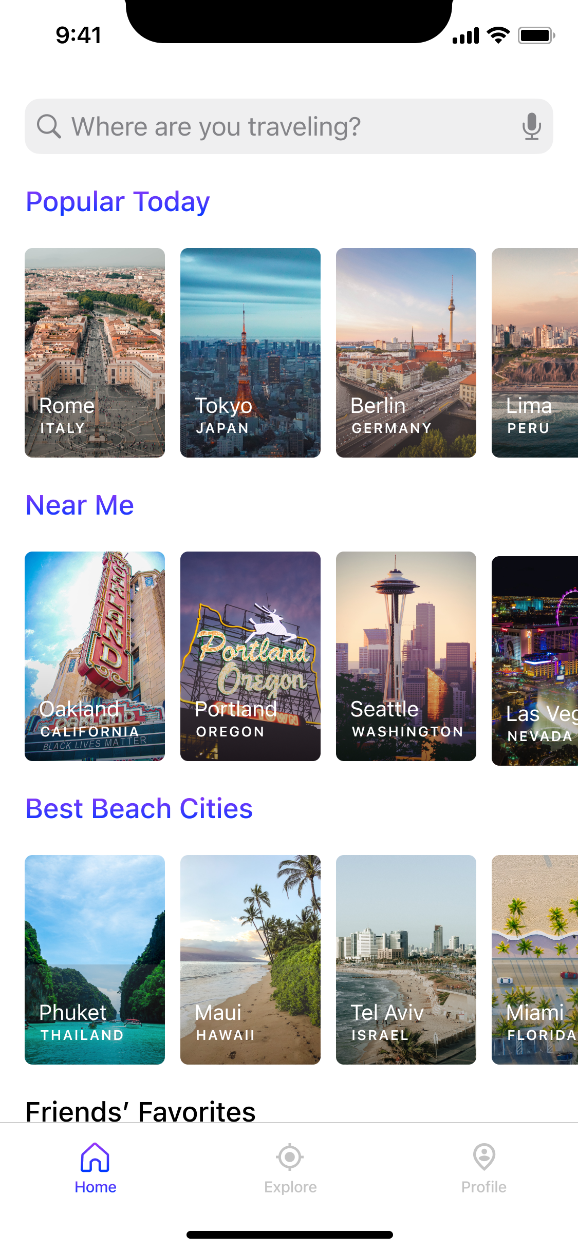
WANDER GUIDE
Travel recommendations from the people you love
From the start, our primary goal was to better understand both the pain points people faced when planning a trip and the opportunities not being addressed by other travel apps.
We kicked-off our research sprint with user surveys and interviews, speaking with people over the age of 20 in the United States who take at least 2 annual vacations to better understand their experiences with trip planning. From the research, a few common themes stood out:
Research also helped us better understand how people were using other popular travel apps. We analyzed and documented competitor flows, strengths and weaknesses to help refine our unique value proposition and product vision.
Before we began outlining Wander Guide’s critical user journey, it was imperative that we clearly focused and articulated our product vision to guide product design and development. Our research and competitive analysis helped us define the core principles that were at the heart of our product vision.
From the onset we wanted to avoid over-complicating the user experience and thus focused on a single use case with a specific goal.

To develop Wander Guide's visual identity, we began by distilling our product vision into elements that could help guide our explorations.
Name
We set out to find a name that sparked a sense of excitement to travel, was easy to remember and had an available domain name and handle across major social platforms. While we brainstormed and tested many names, “Wander Guide” both sparked the sense of excitement we were looking for and tied back to our core user journey of planning a trip.
Color Palette
We wanted a color scheme that highlighted key information in the app when needed, but didn’t clash with the travel photography that was core to the app. The 2019 Colors of Travel Study showed that clay, gold, sky blue and deep turquoise were the most popular colors used in travel photography on Instagram. We chose a purple gradient as the primary color in Wander Guide as it both helped capture people’s attention when necessary and was exceedingly rare and special in the natural world.

Typography
We wanted the app to feel clean and familiar and thus chose to use system fonts throughout the app. SF Pro is a neutral, flexible, sans-serif typeface for iOS, while Roboto features both geometric forms and open curves on Android.
Voice and Tone
Our brand voice and tone is our personality and we aimed to be:
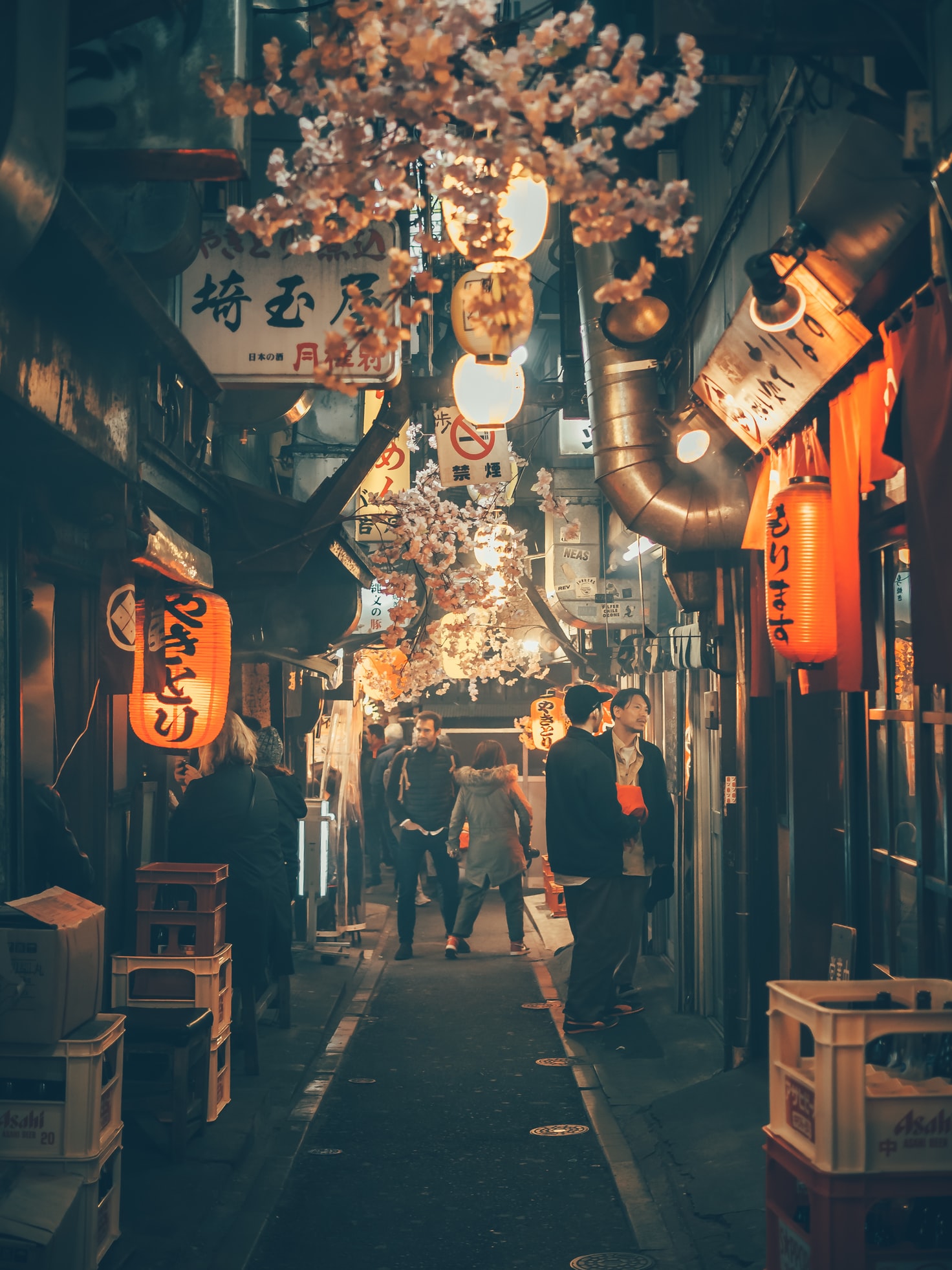
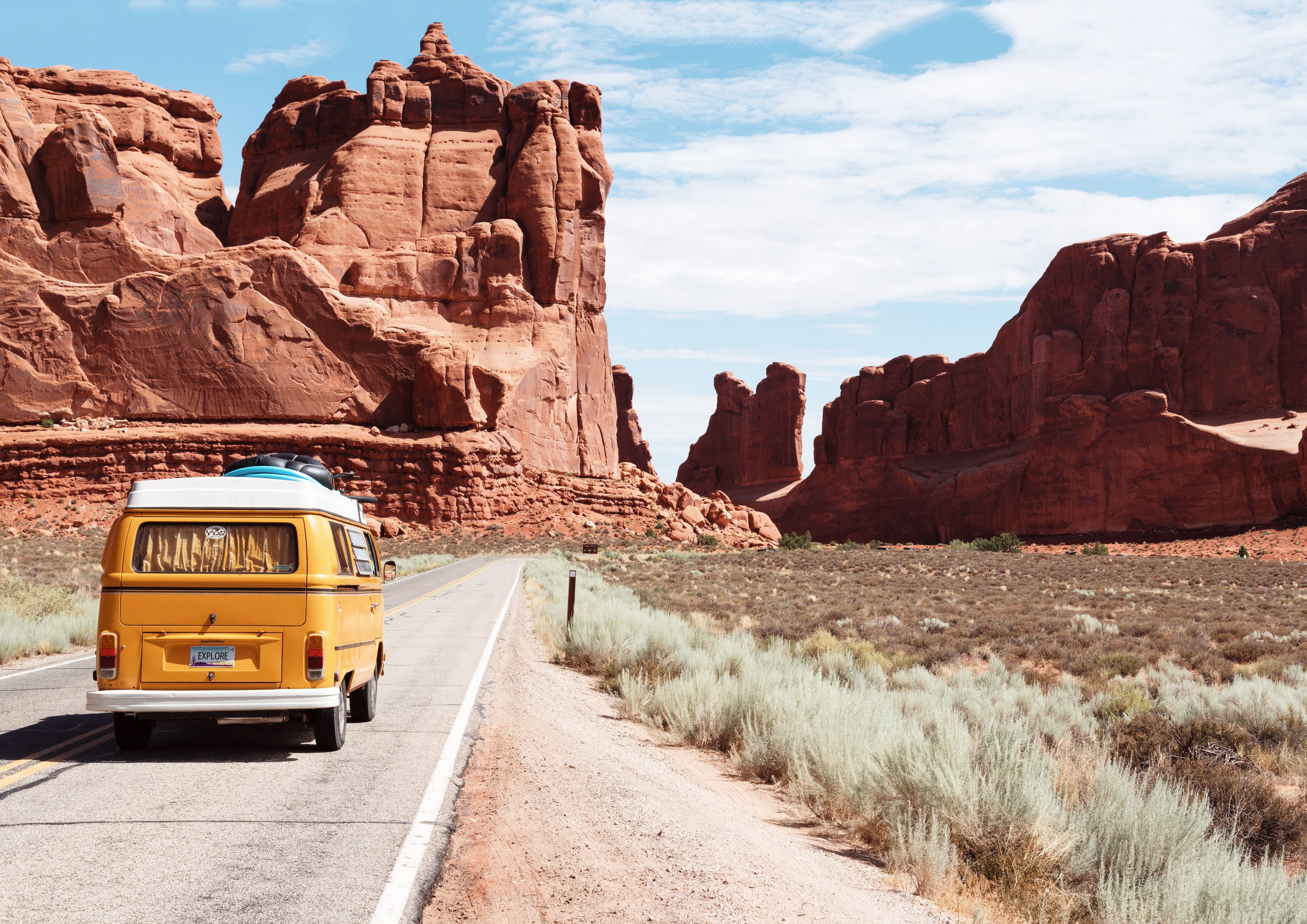
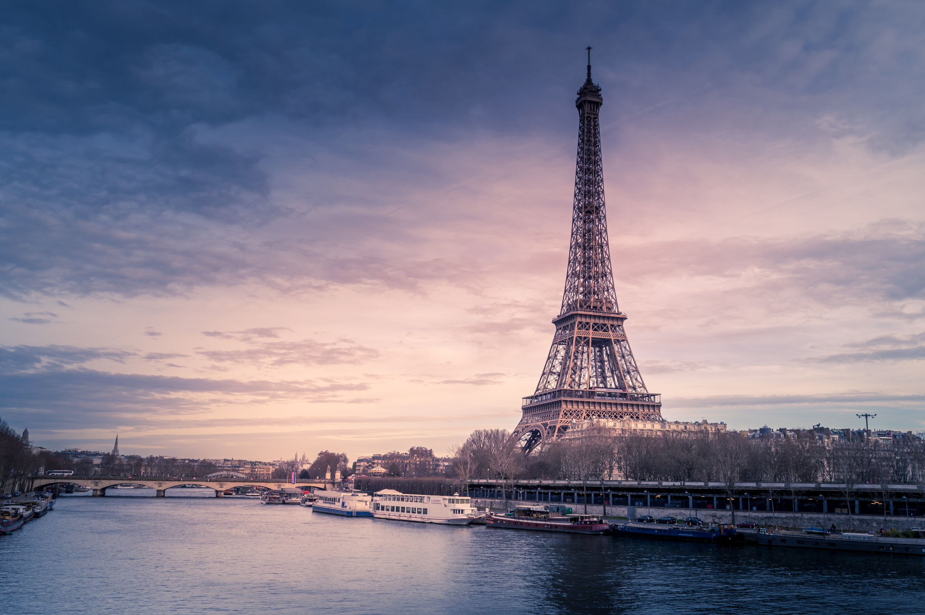
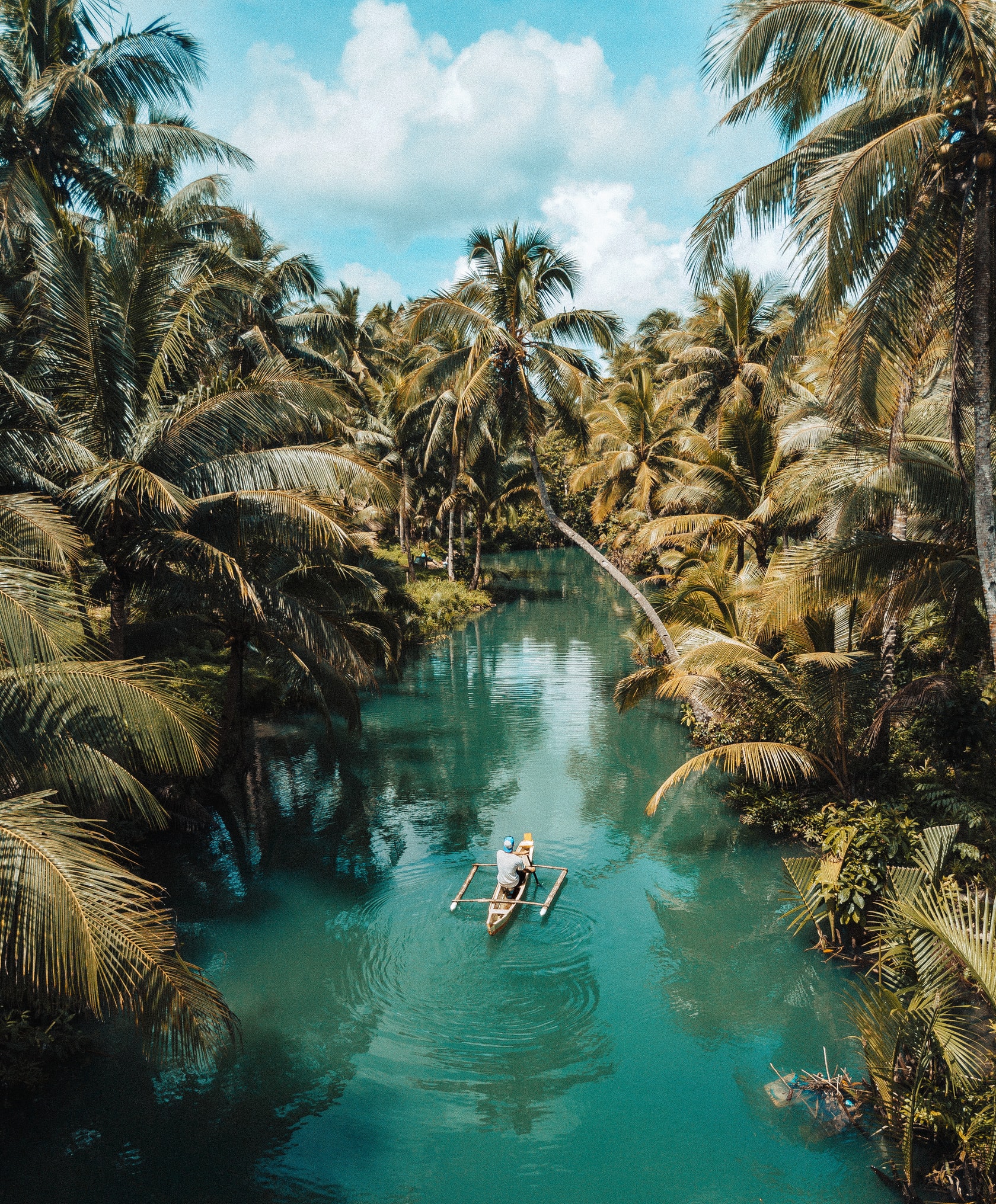
Photography
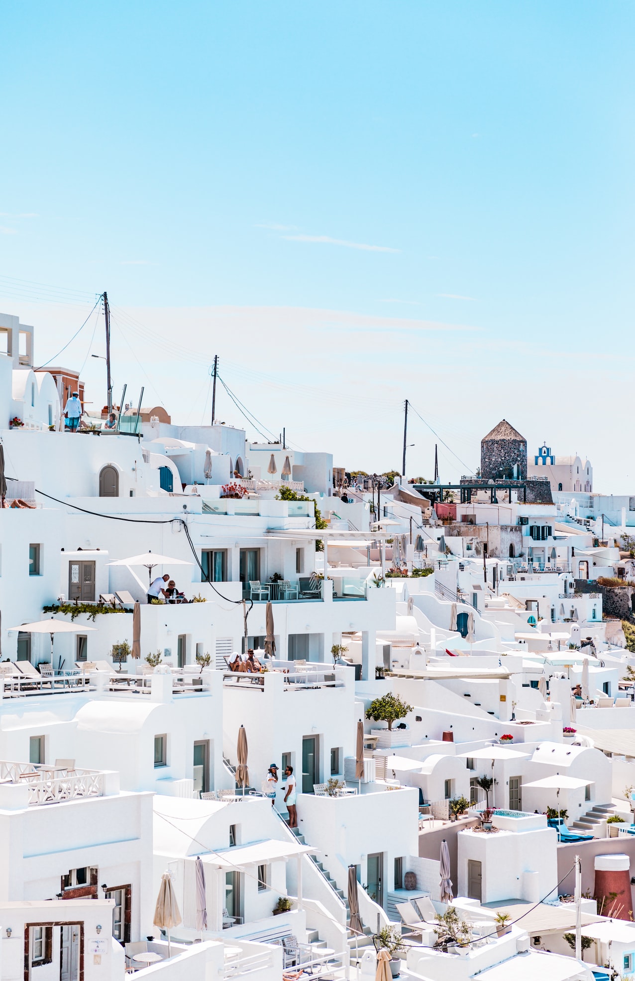
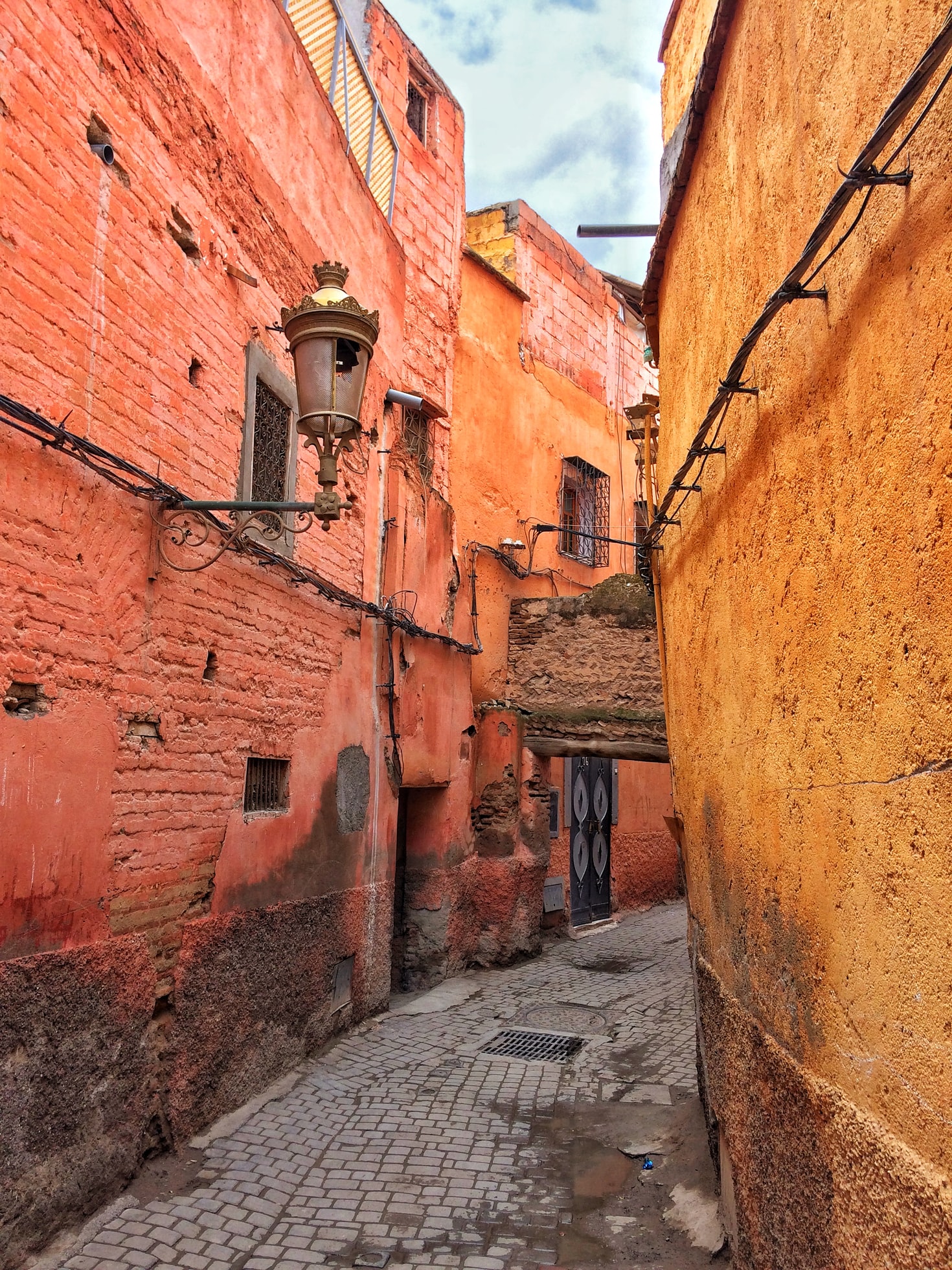
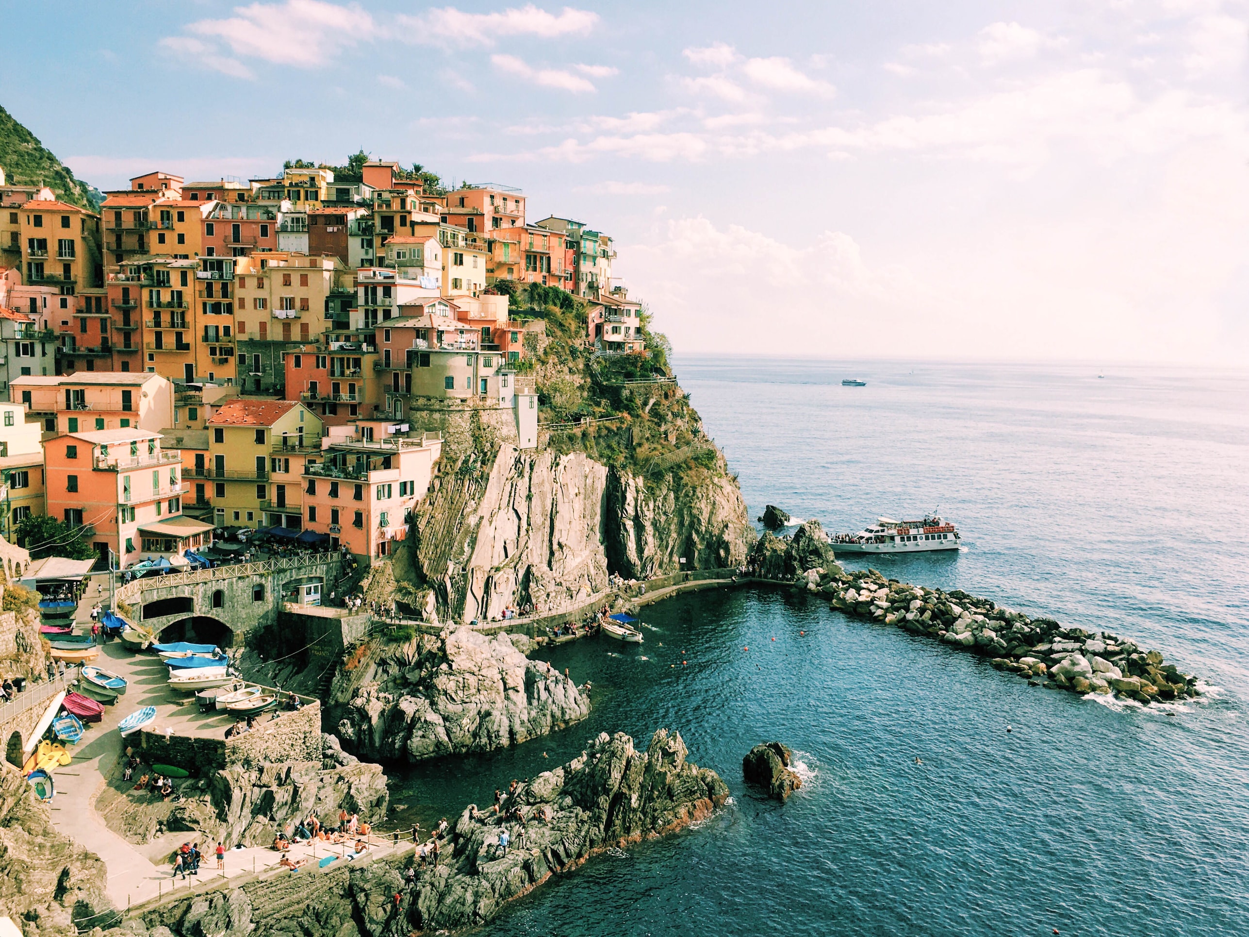
Travel photography is captivating, inspiring and can spark a feeling of wanderlust. We looked for premium stock photography that captured the rhythm of a place with both authentic scenes of daily life and awe-inspiring shots of key landmarks.